Armour, soldiers and commanders

27 Feb

The pictures I have taken span from the 16th to the 18th century, while there was change I like to use influences from all eras to design my characters. These first armour images are for the more standard soldiers, these were plain armour will very little to none engravings and embossing. I feel I could use essences of these plain armours in Guy Fawkes as he was a basic soldier in his past. However I would like to use the intricate designs on the more fancy officers and kings armours.

SONY DSC

SONY DSC

SONY DSC

SONY DSC

SONY DSC

SONY DSC


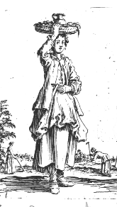
The images above are examples of simple british soldier pikemen in the 17th century, later on pikemen were pretty much removed from battle due to the developments of guns and bayonets. I like the item of soft light clothing and epecially the belts and clips around the chest.

SONY DSC

SONY DSC

SONY DSC


Above are some more decorated armour from the dutch and english  believe, both are of a higher standard and probably worn by a captain or officer.

SONY DSC

SONY DSC


This image below shows the simple soldier armour again but will a little more protection, I like the idea of having bits of armour in essential places to free up movement of the character and a more believable sense.

SONY DSC

The armour of the kings, princes and dukes are completely different in the sense the armour shows off wealth and social ranking. I like the patterns and decorations in the armour and I feel this will be a big design choice in the armour and clothing some of my characters wear, the clothing should represent the wealth and power. Many of the patterns use curves and spirals decorated almost like plants, usually in the middle of these is a more intricate design or image.

SONY DSC

SONY DSC

SONY DSC

SONY DSC


I especially like the patterns on this shoulder plates and can see this in potential designs. I think it is important to decorate the shoulders as they are often easy to see and notice.

SONY DSC

SONY DSC

SONY DSC

SONY DSC

SONY DSC

SONY DSC

SONY DSC

SONY DSC

SONY DSC


The patterns are usually symmetrical so this helps with designing if I choose to use patterned armour.

SONY DSC

SONY DSC

SONY DSC

SONY DSC

SONY DSC

SONY DSC

SONY DSC

SONY DSC

SONY DSC

SONY DSC


This helmet below grabs me upon first glace due to its difference of patterns and design, perhaps it isn’t the most helpful helmet armour wise due to its weak points but it looks great.

SONY DSC

SONY DSC

SONY DSC

SONY DSC

SONY DSC

SONY DSC

Royal Armouries Pictures

27 Feb

Today I went to the armouries to help get some inspiration and historical accuracy by looking at the materials, clothing and armour used in the 17th century. I also took lots of pictures from the 15th 16th and 18th century that may perhaps influence designs or in the case of the 18th century items, have Guy Fawkes using experimental weaponry, items that are in reach of the era but not quite there.

Below are all the images taken, I will split these into various posts with certain items I felt have especially good use for reference.

This slideshow requires JavaScript.

Guido Fawkes Design

21 Feb

Initially the images I have been able to gather off the Internet have been rather focused on the nobility of the 17th century, while this will be useful to bring traits across Guido Fawkes I feel should be more of a soldier or dressed with kinds of a military background, which he has. I want to add a Spanish look to him as he fought for them in the Thirty Year War. I feel as Guido Fawkes doesn’t want to be particularly recognised massively noble and bright colours won’t fit the character.

Below are some images from the thirty year war;

1633 Mosquetero, piquero, arcabucero

I like the baggy pants, which in some cases are exaggerated, that the Spanish military wore, I feel Guido Fawkes would wear lighter clothing with small bits of armour, I like the idea of long socks as well which could be used as high boots.

26-01-05/42

modern-impression-of-a-tercio-by-artist-cabrera-pec3b1a-source-magazine-desperta-ferro

This picture is of the French military but I feel it is relevant to see the uses of materials and uniform by both sides around this era.

30YearWar

0508vela


GuyFawkes military influence

 
Here are two quick drawings I did to perhaps show the basic military look, another design I might think about is him with very intricate ornate armour. I was trying to use some ideas from the basic Spanish military into his costume and how it could influence his clothing, the two variants here are an armoured version and a less armoured more lighter clothing. I want him to look like basic infantry.

Interpretation of Guido Fawkes

20 Feb

Guido Fawkes (Guy Fawkes) is well known due to bonfire night, he has a few interpretations of him and I have pulled a few off of Google to put a basis to work off as after all I am running on the time period, but also to stay away from the stereotypical view of Guy Fawkes and make my designs stand out and be different. Guido Fawkes is portrayed often with a hat and wispy mustache and I like these features, I will try to keep small attributes that keep the character who they are however try to change the rest and create a truly historically fictional world. Another large part related to Guy Fawkes is the Guy Fawkes mask. This mask has been used in protests and actually has quite a creepy look about it, I feel this could be used to design a nice assassin mask similar to the new game Dishonored by Bethesda. However I don’t really want to use this mask too much in the design as it has been used in V for Vendetta.

guido


Guy Fawkes is portrayed with a very prominent beard and mustache, one thing I have noticed is that he is portrayed with quite good clothing, he is not poor but neither is he extremely rich. Again with this image and the one below you can see the hats and long hair.

GUNPOWDER-PLOT_2046765c

Guy_Fawkes_by_Cruikshank


The image below shows a mask that is said to represent Guy Fawkes, it has been used in some campaigns and known as the logo fronting Anonymous. This mask seems good for an assassin due to the errie and creepy mood a emotionless face gives, the smile also adds this effect. However I also found about the comic book/film V for Vendeta which I have not seen, this uses this mask with a character who is also an assassin so I really want to stay away from tis mask. I will however look  at different masks.

guyfawkesmask

images


Some quick sketches I did to picture what Guy Fawkes could look like, I was thinking items that are light and more available to the middle class poorer citizens like linen, perhaps having a clock and a mask to conceal identity. Guy Fawkes should not stand out too much though as he doesn’t really want to be noticed, but different enough to stand from the crowd and be noticeable to other characters.


guido Fawkes Sketches

17th Century Fashion Continued

20 Feb

When I think of Guy Fawkes I picture a pointy hat and long thin mustash. High boots that fold over and a long coat down to just below the waist. In the 17th century there were various periods of style, the style of which I depict Guy Fawkes actually came into fashion a little after he died so perhaps the art I imagine of him is wrong. This era of fashion is called the Cavalier Period. It was a period of richer garments and finer materials, the focus of dress was also having the waistline slightly higher than normal. Here are some images to represent this. Due to Guido Fawkes survival rather than the actual death in history this is a period he would be living through even if he would be quite old for the 1600’s. The woman’s dresses were much less tight fitting and become rather large of the arms and body.

cavalier-man-1

cavalier-man-2

cavalier-man-3

cavalier-man-4

cavalier-woman-1

cavalier-woman-2

cavalier-woman-3

cavalier-woman-4

17th Century Clothing

20 Feb

In the 17th century there was not really a peasant class or a evidently poor class of people, rather the time period reflected that the richer you are the more intricate and colourful your clothing was. Due to this even the poorest citizens look presentable enough and were well dressed compared to many other countries, this is not to say they were not poor however, England was largely in debt and a lot of the country was in poverty. For the working class linen was used in much of their clothing, it was worn straight on the skin. Due to the inability to afford to keep their clothes white their clothes were often beige, grey or cream. Only natural dyes were available but most colours could be achieved, the rich could afford to get more bright and vibrant colours while the poor stuck to what was listed above. Woman in the 17th century kept their hair covered unless rich in which it was often put up and on display in a expensive fashion. Men were not quite the same although many poorer men did wear hats.

Here are some images for the richer society in the early 1600 hundreds;

jacobean-man-3

jacobean-man-2

jacobean-man-1

a484px-Cavalier_soldier_Hals-1624x

here some upper class women;

lbd 1

jacobean-woman-4

jacobean-woman-2

jacobean-woman-3

Here are some lower class woman, unfortunately due to paintings only being constructed for the rich and noble, there is not many pictures of the working class, I will have to try find out some more information about what the poor wore n the 1600’s through primary research.

callot1

callot2

hollar1

women1

women2

Research and Development

20 Feb

Choosing to base my Final Major Project on a self generated plot involving Guido Fawkes I need really improve my resources and reference material I have while designing to create a more realistic history based base of artwork with my own twist on top. There are a few key features that I need to research to get the full potential out of my art work and also to help me create more varied and interesting designs while relating to the period. In the years of the event 1604 and the following years, it is a era known as the Jacobean era, this is an era when James I (IV) came to be King after the death of Queen Elizabeth. The era was a struggle between Catholics and Protestants, it followed the end of the Tudor and Elizabethan period. The first big factor is the materials that were available at the time, this will implement and shape my designs I create from the materials used in clothes and buildings and also the materials I can play with to create some fiction such as assassin weaponry to perhaps an element of magic in the order of the Jesuit, a group of high English Catholics. The second is the clothes used and materials and colours that were worn, by both nobility and the poor. The clothing will have a distinct fashion that I can use to design of off and create my own interesting designs of clothes. A third major factor is the environment and settings they lived in, the building and the architecture that surrounded London in the 1600’s. Basing my art on 17th century London allows me to actually visit London and get some good primary research from the museums there. While I am not necessarily planning on designing transport there may be exceptions such as how Guido travels around in secret and so again looking at the vehicles used in the 17th century can be useful for reference.

The key points summed up for research are;

Clothing;

Style
Colour
Patterns
Shape
Class related clothing
Iconic clothing
Materials used

Buildings and Environment;

Architecture
Style
Layout
Materials used

Materials;

Current Materials
Widely used and common/rare materials
Materials found out in the era
Technology developments

Hopefully with some good research I will have plenty of reference material to design off when coming to moving on to the design stages. I will be acknowledging what I have research in each bit by applying them in a drawing sense by doing small thumbnails and sketches after I have found something worth using or considering.


Image

Halo, Practice of form and lighting

19 Jan

Masterchief

Image

King WIP

19 Jan

As an attempt to spend more time on my paintings and sit down for longer time periods I am working on this piece, the skin was influenced by the artist behind the Brink artwork. I originally started this concept as I wanted to trying painting some more detailed faces and get a nice skin texture. One thing however I need to keep remembering however is that it is good to study someone elses art and use it but not to overuse one and use a broad arrange, this way I hhopefully develop my own style while not becoming a rip off of another artist. As well as painting a full illustration it is good for facial proportions design and colour.

King4

30Minute Competitions and keeping active

19 Jan

One of the most important aspects of painting and drawing is keeping active and to keep improving your skills and mental memory for everything around us. Myself and a friend Jake decided to participate in our own small scheme of challenge, as we were often on Steam together we would put a timer of 30 minutes and draw to a random subject of choice at the time. We would do perhaps two of these a day. These were useful as it kept us active (and stopped us playing to many games) however there were downsides looking back. One which was not particularly our fault was the lack of varied feedback, with jsut the two of us it became very similar and quite often the subjects were chosen to suit the supplier. We did try mix it up at times with using other course mates to decide the topic and we infact had andy and coral join in one one topic. One thing we did not approach was using reference imagery and quite often due to the short time constraints it has hard to use any. The reason for the short time was to increase the speed of our painting, I realise now that while it is good to be fast, quality is better and so you should take your time. “going slow is smooth and smooth is fast”.

We did attempt to go over one of our previous paintings and develop it further based on critique and feedback, with these we spent about 1-2 hours. Mainly to go off our initial design we usually block out in the 30 minute timer and add some detail and focus. Overall it was a good process and kept us working when perhaps we would have been idle, in the end however the workload of actual university work put this on hold and we never really got back into it.

Below is the blog (and a screenshot) we used to post out art, the idea I was hoping was that more people would get on board but it was not practical for anyone other than the concept artists. http://30minartchallenge.wordpress.com/

Capture11

Below is most of the artwork both me and Jake created.

Image

Temple 30 Min Sketch

17 Jan

temple3

Lizard 30 min sketch

17 Jan

lizard1

lizard2

lizard3

Competitions

9 Jan

After the christmas a new year break in where I was limited to pencil and paper, when I got time, its good to have my tablet back. I’m going to enter a few competitions, 1. to show my work. 2. to get back into digital drawing and not to go rusty, especially with my dissertation on going.

The competitions I have looked at are;

http://www.artsthread.com/winston-churchill-design-competition-2013/ – A bit different this competition is to encorporate Winston Churchill in modern day life and how he would fit in, interesting and gives a good solid brief. More of an Illustration role.

http://challenge.cgsociety.org/

http://www.3dtotal.com

Both the above are high level concept and illustrations in which I feel i’m not ready for yet, however I will keep an eye out for their competitions in the future, the cross society domination competitions are also nice to look at.

http://conceptart.org/forums/forumdisplay.php?81-Creature-of-the-Week – the conceptart.org is a more friendly website aiming around my level as well with some good feedback. I am going to enter the Creature competition running and also the environment on or character, if I enter two every so often it will help build my online sketchbook/portfolio as well as help me with my painting skills. They are every two weeks I believe so these will keep me busy for a while.

Professional Blog

13 Dec

In the industry on games it’s either your show reel or you portfolio that will land you that job or position. I have started another(hopefully more professional) blog under the address stephencusdin.com. I need to change some layouts etc and generally draw more and put more stuff up, ideally at the end of the year I want a balanced portfolio of really nice imagery as well as a section for sketches and more practice work. The layout needs work in terms of getting to a full size mage as well, one thing I read recently from Noah Bradley was that artists who have complicated to navigate imagery often get over seen due to the senior person not having time to waster checking it out. His advice was to have large displays of your work with easy access to them. At current it takes me 3 clicks to get any image full size, ideally I would like that to be 1 click. Back to work!

Conceptart.org

13 Dec

http://conceptart.org/forums/forum.php?s=dc2d18bd929e7815363733c465ba28cf

Conceptart.org is a website and community of collective artists specialising in all sorts ranging from professions to out right beginners. This site as well as having a few tutorials and help has the ability to add sketchbooks, this allows the artist to get their work out there and have a good standard of critical analysis.(providing it is updated regularly).

This website has a wide array of media ranging from unfinished 2D sketches to fully rendered 3D animations, this allows you to get feedback and sometimes work alongside people in any stage of the process of design to finished project. There are also live briefs that I need to get involved with as well as start my own sketchbook which is in the making! I’ll update this with a post when I created my sketchbook and also hopefully talk about some of the feedback I get given and where I would g to progress.

Some Sketchbooks that have caught my eye and are what I think around the same level as me (or in range).

http://conceptart.org/forums/showthread.php?249215-Theonlay-s-sketchbook – This artist has good rendering of clothes and faces and uses form well but sufferes from the same problem as me, stiff characters and imagery. I will progress with poses and forms in the future as well.

http://conceptart.org/forums/showthread.php?223942-Rev-needs-to-draw-more-Posting-daily! – This sketchbook is good at poses and shows his references etc which is what I need to do, REFERENCE and use REFERENCES!

The Gnomon Workshop

13 Dec

http://www.thegnomonworkshop.com/

As part of a PPP brief I have decided to look at the online communities for someone looking at digital art and in particular concept art. This website is a bit different to my other choices due to it being a website that specialises in 3D material as well as traditional drawing and using Photoshop, this website gathers all the different mediums of creating illustrations and concept art. Many artists use 3D elements in their paintings to gather the right perspective or simply block out shapes, others actually model and texture the whole design and so I shouldn’t just focus on the photoshop/painting stuff but also how to light 3D models and modelling as well as they both link to getting proportions and form right.

What I get from Gnomon Workshops as an artist is a variety of tutorials spanning from modelling to rigging to texturing to painting. There is also a community for work feedback and as usually the process of concept art is t then go to the modellers, who better to critique your work. I did state above that this is primarily a 3D online area however they do have a small section of tutorials on Matte paintings and also a small collection of Photoshop tutorial. The biggest downside for this website as a student however is the price of the tutorials and subscriptions as they can be quite pricey.

From a personal opinion I find one other downside of the site is that it is very centered towards the realism aspect of design and less characterised. I am not going to say less stylistic because after BAF my opinion of style in a game is completely different. Realism is a style in its own but again I feel it lacks that kind of meaning.

Dermot Power: Artist Influence

12 Dec

http://www.dermotpower.com/home/index.html

During my most recent project I reference and tried to imitate the art of Dermot Power, I found out about him from Lucas Hardi’s talk at BAF games. The reason I really like this artist is his style. His pieces consist mostly of solid colours with good detail added to show what exactly the character is wearing or doing. Power’s poses and silloutte work is superb and this simple use of colour and line drawing makes for extremely pleasing and interesting imagery. I have tried to imitate this style however it is harder than it looks. Firstly I found you cannot be too loose and the solid image needs to be to a good standard so the viewer knows what it is. I am sure to progress and use this in some of my future work due to the fact you can forget about the fancy shading and worrying about the light sources and focus more on the subject. One thing I have noticed is his use of simple colours for clothing however skin and faces are quite detailed and show a good use of colour.

BAF 2012

12 Dec

Perhaps a little late to blog about my visit to BAF 2012 but better late than never! I bought both tickets for the game side as well as the animation side so I saw and learnt a lot over the 5 days. The talks I have listed below are all the game talks, I am mainly going to talk on these because I felt them more useful to my own progression. While the models, design and animation techniques for both Laika and Ardman were amazing to see, they didn’t really fit into my area of study.

These three talks below while also being from the “big dogs” of BAF Game 2012 were also the three best in my opinion. The best thing about them was that neither talked on the same topic or said the same things and due to this I found them all immensely entertaining and full of pointers and facts for me to take away. I advise anyone who hasn’t seen them to watch them and I’ll tell you why…

Lucas Hardi was on the first day and talked about game’s art styles and the art directions. Just for a bit of back story for Lucas Hardi, he has been working in the games industry around 10 years and currently works at Bethesda coming from Mythic Studios. He has worked on titles such as Dark age of Camelot and Warhammer Online (which is a game I played quite a lot), and his most recent Skyrim (although he joined near the end of production).

I think this talk was very useful because in my independent practise that was running at the time, the group I was working in hadn’t really decided on an art style or direction for the game we were designing. We later had troubles when it was put together about how it would fit and look etc… Hardi talked about how technology has widened the gap for art direction, his two examples Metal Gear Solid and Mario and how they have evolved over the last 20 years. Art style has many layers that blend together to create the final production. We looked at Scott Mccloud last year and Hardi brought it up as a triangle to base game art style on, from realism to abstract and also meaning. For one point he talks about many people aim for realism, it is seen as the perfect point to hit. But with realism comes problems and especially with games its hard to blend cinematic with the game, especially when the cinematic can look so much better. I could talk more but you can just watch it! What I learnt from this talk is to adapt my art style to what the game is based on, and I’m not talking just real or cartoony. I am also referring to whether the art piece needs detail or a more loose style, and whether the art pieces need to look large or compact. This type of style is what is the small layers and details, and with with art telling the story and allowing others to gain inspiration changes like this set different mind sets.

The next talk by Valve’s Christine Phelan was an interesting talk also. While not totally relevant as she specialised in animation and not art, her experience of her progress can be converted to other disciplines. She talked about how she left University and found herself doing what she does now, it is nice to see something like this because it shows it can be done, especially when in the art degrees you are often given the impression most of you will fail. Phelan has worked for Nickelodeon, Double Fine and of course now works for Valve on DOTA2. I think the biggest thing I grasped from this was to get your foot into the door, show people your work, try grab internships/work experience and have a good show reel (or in my case portfolio).

The last talk of the BAF Games was a talk from Neil Thompson at Bioware. Now I hope he doesn’t mind me saying this but this guy is a oldie when talking in terms of working in the industry of computer games. He lists his previous experience so I won’t list them as there is a lot. Thompson’s talk was about how the industry has evolved and also how short it is, a phrase I remember him saying is that no one has really retired from this industry because its too young. Thompsons talk was also a good realisation of how successful games might not bring you the success you particularity want and also how publishers can be a big problem when decisions are concerned. In this talk I learnt a lot about the short evolution of the games industry and how I have my chance now to jump on board as its only just begun. Also to have the most broadest inspiration palette possible.

Sterotypes and Game Design

4 Dec

This will be a short post about the characters I have and why I have chosen them. Also some notes about game characters and my opinion on them and how they interact with the player.

My main character was briefed to me as slightly overweight and wearing a cheesy Hawaiian shirt. The challenge with this was making the character be aspirable to play if this concept became a game. Players in games are the main protagonist 99% of the time, this means they do all the work, they save everyone and are frankly just awesome, it is this idea of being so amazing that helps them enjoy the game and for some escape boring real life. For my character to be appealing I wanted him to be shown in a powerful and strong willed light, a light hearted character but yet fierce at the same time. Due to some of the traits given to me this was done to what I think works. One way I decided to make him stronger was give him weak and feeble people to work with, all the other survivors have major flaws. The mother is emotional unstable as well as under immense pressure to look after her child with her husband missing. The child is only a young girl and cannot fully support herself. The muscular man has a handicap as well as being aggressive and emotional unsympathetic towards others and generally bad at team work. The last character is heavily obese and short, this un-gifted individual is not able to fend in an hostile environment and thus needs support.

I used weak characters to make the main character stand out more, in the game environment it also allows the game designers to fill the world with problems from these other survivors to create content.

I do believe it is important to be the biggest character in the game and feel the most important, even bigger is to be the most rewarded. On the other note it can get frustrating for everyone else to do nothing for themselves at all, a balance must be made. Two examples I will give which in my opinion are bad designs are first COD the world war two ones. You often found yourself fighting the Germans with no support or help from other soldiers, I found in the most recent this has changed a lot and quite often your squad take fire and dish out a fair amount of kills. The other example on the other end is GuildWars2, while you are the main protagonist and save the world, you are brought up with a side character who is credited with it all and you as a player feel overshadowed and under appreciated. I like to think I have taken both these into account when creating my five survivors.

Character Revamps

4 Dec

Looking back on work I can diffinately see where I have improved and where more work is needed so in a sense this project has been very useful for me. My most popular style looking back was when I created character 4 the Lonewolf character. I like the way the solid colours created a nice sense of form and lighting. I decided to go back over some characters I felt were lacking art wise.

Char_one_beforeafter_turnaround

For the main character I felt he was “off”, his arms were bent in the wrong direction and his legs were too short, I also felt his shirt was too irregular and random, not really giving the attention of the bottles on his shirt. I also wasn’t happy with how the character portrayed himself in my mind on first look, I wanted him to be a strong powerful character despite being slightly over weight and wearing clothes that could be considered inappropriate for survival in a jungle. To start I reshaped the body, the arms and the legs to make him taller and more muscular, these two traits add power to the main character so the viewer is more inclined to want to play as him. The main character I felt needed this for a sense of believability that he had the will and strength to overcome the obstacles thrown at him in the actual game.

Char_Three_beforeafter_turnaround2

I felt the original girl character despite already having the face repainted lacked the proper colour and form. I started with the face which I felt was the worst part, I thought more of child curves, button nose, and large eyes. I also added light to the hair to add form to it. One quite good change was changing her skin colour, I felt by making her more pale it indicates unhealthy or weak, it reasserts the player with the feeling she is vulnerable, and even more so in this environment. I painted more solid colours to also remove the “muddy” style which I had painted before, and in fact I need to learn to get over the type of muddy painting I quite often accomplish. I feel the solid colours make her also more vivid and bright and again is contrast against her skin.

Char_five_beforeafter_turnaround2

With the fat character I felt his style of a quite realistic painting was too far from the other character designs. He was also a little bit muddy and dirty and I felt this style would suit a bit better. While I lost the nit gritty style I had previously achieved I felt the character developed a more feeble look which I wanted from the start. His bright pink skin also brings out that gimmicky tourist feel I was trying to achieve with the hat and shirt.

Character Group Illustration

4 Dec

FInal_mainscreen proposal4_placeholders

This is the design for the final image of all the survivors, due to time constraints it is not as like as I would have liked, and thus the characters were just placed in as placeholders and not really interacting with the scene. However I did this in a LOST kind of style to just show all the characters together.

The background was created by a technique shown by Feng Zhu in which he refers to it as an happy accident or from chaos to control. The technique involves using random brush strokes to form a background and cutting, rotating and generally jumbling it up. I did this for a backdrop then added detail on top, I also had a good custom leaves brush. I tried a little colour editing to fit the characters into the scene a bit more.

FInal_mainscreen close up

Here is a close up which in my opinion is a better shot due to the fact you do not get too distracted from the whole backdrop and they don’t seem as out of place.

Character Five: The Fat Man

4 Dec

Without being too harmful and offensive to Americans, with this character I am playing on a stereotypical trait that most Americans are obese, while this might not be exactly truthful having a extremely obese character brings diversity into the group. The main character while being slightly overweight has the feeling of muscle and power behind him, his height also shows the viewer he isn’t weak. I want this character to be the opposite, I am looking to get the feeling across of a fat, small, weak person who is yet another burden. One thing that is apparent is that all the character seem to be a burden and not very useful in the current situation. The reason for my character choices are that in the game as the main character you do not really want someone more important than you, causing problems mean you also have problems to solve and to bring the group together and help them, the characters in my opinion suit a game perfectly.

Reference material as some pictures suggest I was going for a crude topless uglyness…

Char_5_intialdesigns

Again starting with some silhouettes, I found the TV series “The Biggest Loser” great for reference material here and beyond the initial design stages.

Char_5_intialdesigns2

I took my favourite pose and added some solid colour over the top to reference clothing and detail. I was thinking another type of shirt and would have most likely gone Hawaiian if the main character didn’t have one, Hawaiian shirts are kind of a gimmick and allow the user to take the character seriously in my opinion. I stuck with a standard white shirt and wanted to go from there, I was going for a grotesque fat American type who is messy and not attractive, he needs to portray a lack of respect for others around him.

Char_5_intialdesigns3

I then used my previous technique of a development line and coming towards the final character. As previously stated I am trying different art styles and with this character I am going for a more life like character render. I have chose an open shirt to portray his fat belly but also his disregard for others by showing everyone a not pleasant sight and not really caring.

Char_five_beforeafter_turnaround

This is the final character turn around I came up with, I have not designed an after crash for this one as not much really changes on him. Hopefully the style of painting shows a more gritty and realistic style. I used dirty colours to make him seem more grotesque and added “dirty” attributes such as bad chest hair that is on show and flushed and blotchy skin. As well as the standard double chin. I added a hat as like the Hawaiian shirt a typical holiday hat is a gimmick and makes him seem more touristy. The character I had in my mind at the start was the fat policeman out of James Bond, that was my mental influence anyhow.

Character four: The Lonewolf

4 Dec

Without giving my characters too many fancy names I have named this character the lone-wolf character as to me his initial designs were based from the bad guy in post apocalyptic films or series. In LOST it was Sawyer, both The Walking Dead and Falling Skies have a character or more that likes to break the mould and cause trouble despite being united with what seems to be the last of his won kind.

For me this character needs to portray the personality that he is number one and will not put himself in danger for anyone else. This of course could change if a story was written out, thus evolving his character. To portray this I have the picture of a strong male who has never really relied on anyone before and doesn’t plan to, he also finds it annoying to cater for characters 2 and 3 especially due to their “uselessness”.

Char4_intial designs

I started out with some silhouettes like I have done in the past, however I still feel like I need to create more designs and variations, this is partly due to inexperience and lack of practice and skill at the moment. Also with this project I have found modern day challenging in its own way as you can’t add all the fantasy and sci-fi bit and pieces and instead you have to stick to more standard life. Also with the art style we are going for it has to be relatively realistic. I have decided to go with some form of disability from injury in the crash this could be a broken arm or leg/fractured. This means the character who has done everything himself and is self reliant doesn’t necessarily have the strength now to do it all himself, now he must rely on the other survivors I felt this story would give the character more depth and also a reason for staying with the group.

char4_initialdesigns3

I next took the silhouette I found most suitable and added some small details on top using greys and whites, these were to understand some clothing designs etc. Again what I said above can count… Practice, Practice, Practice.

Char4_finaldesign1

I moved again into more detail to get the shape and idea of the character more refined before I moved to the final design. I had a few things to think about clothes wise, I wanted primarily dark colours to show he was not the best of characters. I also did not want another shirt as I was thinking of using a shirt on the next character, the design I looked on was that of a sports or gym person having a vest top. This also shows his muscle to indicate he is strong and fit.

Char_four_beforeafter_turnaround

This was the final design/ character sheet I came up with. I have to admit it was late so excuse the quality! Firstly I created this character in black and white and tried to add colour using a layer of “colour” to paint over the design, this left an odd colour almost a fake tan effect. His facial features also look out of place considering where the plane is flying from, his face was very much an accidental Chinese design from the start due to a small jaw and round face and curved features, I tried to remedy this with more sharp accents but it still looks wrong. The pose also seems off, I believe his shoulders are too far apart and his limbs are too think indicating he is a very small and stocky man which is not what I want.

Char_four_beforeafter_turnaround_version2

So.. I redesigned him and scrapped the last design, with this design I tried again to go with a kind of Dermot Power design using solid colours but this time I added more colours to my pallet and tried not to use any line art. I actually really liked this style. One influence was I was watching a video from Feng Zhu, he talked specifically about form and lighting in a piece and that is what I was focusing more on this design. Using form to show the character and not worrying about details such as the eyes and skin blemishes at all. I used an anatomy book to get more accurate muscle designs on this character.

Character Three: The Child

4 Dec

The third character I have chosen to design is the child of character two. My initial thoughts for this character is that she is going to be a young girl, full of life and energy but also vulnerable and not really understanding of the predicament of what they are all in. I want her to be a character the viewer can see as a bright light in a dark situation but also a great responsibility and source of vulnerability.

Below are some reference images I have used…

Character_3_designsheet_one

I put together a small moodboard here and a few quick sketches to decide what size the child will be as there are of course many age groups, I went with around 4-7 years old so she is young yet able to do certain things for herself. A big part of the character will be her inept ability to understand the severity of the event, due to this she gets annoyed and grumpy a lot when given bad food and not given the comforts she is used to.

[Insert size guide]

Child Designs_character 2

As a type of design I tried with the mother I have used again with the child, this is the process of working from shapes to build the final character, I really like this technique as it works and shows progression towards a character and working at a good speed. In the future however I will probably need to do a few more of these to get the different designs as I find these quite limiting in character design and variance.

Character3_Poses

This sheet took the designs from my progression design sheet and started looking at the more detailed character and looking at personality. I tried to portray this through poses, the poses were using a diagonal brush and quickly done almost as thumbnails, I was trying the idea of quick concepts but that are readable. This needs work admittedly but i think its a step in the right direction for more detailed designs.

Char_Three_beforeafter_turnaround1

This was the final design sheet I created. One thing you might find is that my characters sometimes don’t look very similar art style wise. I am currently looking at various artists and attempting to design using their style. This character I was trying to use solid colours and line drawings, I got my inspiration from Dermot Power and his work which was mentioned at BAF. He uses very solid colours not bothering with shadow or form, but getting the details in, he uses this in his Beowulf art.

Unfortunately my character does not look my like his designs but I did like the line drawing side although a little messy. The face however needs some work as it is too messy. I need to use more solid colours also and the child’s body needs some work.

Char_Three_beforeafter_turnaround2

I changed the face slightly to give more detail and look more messy on the before model. One thing I have found quite hard is how childrens faces differ from adult faces. The foreheads are smaller, the eyes are often bigger and they have small button noses. The faces are also very rounded. Arms and legs I struggled with and it is still not perfect as I have never drawn children characters before, children have very thin arms and legs if skinny and hardly any muscle definition.

Character two: The Mum

4 Dec

One of the first characters you would meet in the finished game would be a mother who has lost her husband. She is also a kind of duel character as she is linked with another character who is her daughter. The characters personality is fragile and she is not the most capable of surviving in this post-crash environment, this leads her to be a sort of burden for the others as she becomes more of a mouth to feed. She is however a mother whose strength does show when here daughter is involved. Her weaknesses irritate certain other survivors but they must all work together.

I have chosen to play on a stereotype of a weak fragile woman instead of a strong one because you can feel more sympathetic for a woman in distress, and while she is considered weak she has a strong inner self that can be relied on in the worst circumstances, this could be used in the game to show a progression of the character. I would have the npc characters have personalities and stories as well as development to help the player feel this is a real world.

I start with looking at pictures and expressions of women, specifically the faces of women. They often have a more curved chin to ear than men and all round smoother and rounder features. To express beauty larger eyes and lips and especially eyelashes can be exaggerated.

Below are some reference images for the Mum character…

Character_two_designsheet_three

mum Designs_character 2

Mum_char Sheet

This was a design sheet trying to work with poses and conveying the characters personality. These exercises help me with my poses and drawing multiple drawings without spending too much time. When I started this project I feel I wanted to do a lot more with the development side of the characters by having lots of design sheets for each one with expressions, poses and a larger variety of designs. I feel the with the mum I haven’t really done this to my full and I believe this is because I just jumped with the first design I saw, hopefully I can change and improve this on the other characters.

Char2_turnaround

This was my final design and first turnaround, the character has quite dull colours and I did not want the other characters to stand out past the main character. I tried to portray a sad character and frail one. The style I painted this character in was one of trying to get the gradients right and I painted with a square brush which is new for me. Originally I was going with a more posh character and felt it would explain the helplessness more as she has had everything else done for her in the past. I moved from this as I just wanted a standard hard working mum so when she evolves into a stronger person the players feel more attached.

Char_two_beforeafter_turnaround2

This is the before and after design, I decided to put an after crash to show what she might look like after all the crying and panic she has endured. I have also changed her legs and calf’s as they were too big. With this character I felt restricted with the fashion for modern day, which is silly as women have so much fashion nowadays so in future more reference material is needed before setting on the final designs, I think I haven’t due to time constraints.

Original Concept

22 Nov

This is a piece I drew before really looking into the project, this is the starting image or picture I had to start with, the picture is rough and not very good but it shows a progression of what I thought he would look like and what he does now…

Shot outside has obviously changed as the character doesn’t see the outside game level, I might however do a Illustration of all the characters outside in a “LOST” kinda of style.

Character Illustration

22 Nov

As part of the main character I am going to create two Illustrations and maybe more if I have time after designing the others. I am hoping that these illustrations tell more of the character back story and personality. I am going for the more realism style however like said earlier its a very HL2 art style and so the character will be made realistic to an art style with the limit of modeller skill and technology.

This first one took a few hours and while I’m not totally satisfied with it I am going to leave it for now as you can get wrapped up too much doing details, I am hoping again it shows some of his personality and predicament. The chair is from the modeled Business class seats and he has taken advantage of the drinks menu available to him. He is located near the back of the seats as this would take less impact than the front, it also allows him to go forward and explore.

My next painting was more of a speed painting to depict the chaos of waking up in this crash plane environment, nobody is there and what is going on is unknown. It was also a test at some colour.

Character Tunrarounds and Final Design

22 Nov

Below was the design I went with as a final, the reasons for my choices were on my previous tries at different clothing. I chose jeans as an option due to the fact he lives in this hot country so he is more used to the heat, a lot of times on holiday I see the residents there wearing jeans as shorts can seem informal. The reason I went against shorts were that the character almost looked to touristy for being a resident. The Hawaiian shirt I was briefed combined with shorts didn’t really look too great and made him look more of a fat lazy joke character where I wanted him to have a sense off strength to survive the crash. Due to the potential project of this becoming a game I thought to keep the items on him limited so they did not have to model too much. However I have given subtle items such as a Rio Olympics watch, which goes back to the storyline, and marriage ring and a cross necklace to show his religious beliefs. The religion could be played on with his drink problem and the situation he is in.

I have wanted a vastly different character after crash so you can see he has gone through the ordeal, while I watched a live plane crash on a channel 4 documentary, the dummies didn’t actually take too much damage other than the initial impact. There was a few debris that could have hit the dummies but altogether I have not added too much wear and tear on the character. He has too cuts/rips in clothing where I am suggesting it got caught on snags of debris. I thought a good way of making the character stand out was to have a huge wine stain down his shirt, this fits in with the character’s story and adds a very different style to the character that boarded the plane. His shirt is also popped open. The only problem would be telling the story that it is wine that has been spilled and not blood, this could be from a short cinematic or props around him that hint to this.

Style of the Game

8 Nov

Working as a group designing a potential game, all the parts need to come together and look the same. The modelling is a quite realistic design of an commercial airplane, this means my character designs cannot be majorly far from that sort of feel. A cartoony character would definitely look out of place in this world. However realism is a two edged sword, it can look really nice however if it is the slightest bit wrong it will be seen as strange and have a bad feel to it. This is stated as “uncanny valley” when something aspires to realism but doesn’t quite get there and ends up looking horrible. This is due to the fact we as humans see real life every day, we know what things look like, what they should look like and when failing to look exactly like it should, it looks wrong.

The art style I will compare my characters most like to is Half Life, you can see from the image above of the real life to model sheet, that they were not going for a realistic look but rather to get as close as technology can get it in a exaggerated realism style. The faces don’t look real, but they look human and are recognisable. With this style I feel if it ever came for someone to model my character they would suit the environment and not look like a disfigured human being. I have created this by giving my character cartoony exaggerated features, he has a small forehead small eyes a large jaw and big mouth, things look slightly out of proportion (much like Team Fortress 2) but in a manner that looks human and more realistic in texture.

This image kind of shows how caricatures can subtly effect a face. I am heading for the middle ground in this, I want the design to be exaggerated out of realism but not so far it doesn’t fit in with the realistic environment.

Richard Anderson

7 Nov

For my dissertation I am choosing to compare two artists, the first being Richard Anderson, he has worked on a lot of book covers and most notably worked for 8 years in Arenanet on Guild Wars 1 and 2. The main reason I have chosen this artist is his unique style of painting, they revolve a lot around loose messy painting and custom brushes giving an energetic and lively feel. The way he conveys his strokes and colours mean the subject however is easily recognisable for what it actually is but with a beautiful feel to it. Below is some of his work so you can see for yourselves.


Competitions and Feedback on Work

7 Nov

Artistsarena.org is a website created by Xia Taptara who is an artist I have followed for a while and used for tutorials. The website has regular competitions in which I will start to enter, the reasons this is good I believe is that it is not filled with professional standard artwork all the time, it is a lot about learning digital art and progressing, there can also be some nice feedback given. I have just missed the most recent one which was a brief of combining Red riding hood with horror. I might give this a go even though I’m late and see how people respond to the artwork.

7 Nov

This slideshow requires JavaScript.

Here are some rough designs started before painting the initial character design. I am working hard to try and improve my thumbnail sketching and designs as it is a weak point of mine at the moment, hopefully by the end of this module it will have improved. The idea of these sketches were to get a feel for the human form but also get a sense of how big, arm to leg to body proportions etc.

Plane Crash: Main Character Body Shapes

7 Nov

Here is the design sheets for some clothing, I created a few sketches of his body blocking out roughly and I have chosen the body on this page. The reason for choosing this is that while being overweight he is still quite muscular and strong, this implies his hard working background and also adds to the believability that this person could possibly survive a plane crash scenario given the right chances.

Here are some facial designs and the pictures I have used as reference and worked from. One character that I felt was similar to mine was the uncle in Ben10. While being overweight he has a major role in defeating aliens and this is despite his lack of magical or alien powers. This type of hero is seen as strong despite not being a skinny muscular hero, this is the look I want for my character. On the side of looks I am going I suppose a more exaggerated look when designing to give him a smaller forehead and a very large squarish head. I am also able to portray this character good nature with this face while when angry looking very mean, its a face that portrays his mood very well de to the exaggerations.

Plane Crash: Main Character Intitial Design

7 Nov

This was a design produced for a presentation and the team felt it necessary to show some design of the main protagonist. I am going to work on with this but try the clothing, small changes to the characters shape and work on the personality and how this shows. The first thing I want to nail down is his body shape and facial features after that I can work on his emotions what they look like and how he moves etc. I plan to show these in design sheets, I am finding this quite challenging and fun due to the fact I have not really had experience drawing a larger human being. Mostly in the past I have painted or draw muscular heroes.

I have pictured him with a small bag due to the fact I am planning on doing a before crash and after crash picture for most characters. This will help tell the story more and allow you to see what they have gone through… a crash landing.

BAF and BAF:GAME, Talks to look out for

24 Oct

BAFter Hours Every day 5:00

Tues

Tomek Zawada, CD Projekt Red – Movies vs Games, Which Industry Fits You? 11.30
Jennifer Schneidereit and Philip Tossell, Nyamyam 2:00
Lucas Hardi, Bethesda Game Studios 4.15
GameCityNights 6:00 (4hours)

Wednesday

Christine Phelan, Valve 11.30
David Brown, Philip Gray and Bill Martin, TT Games 3pm
Neil Thompson, BioWare 4.15pm

Sat

Bradford Animation Festival 2012 Closing Night Party 10:30

Games Companies in Leeds and Around

24 Oct

Hopefully this year I will be able to collect some experience working in a short term internship or visit to a games company and see how the concept artists work as well as the rest of the process. I have looked around Leeds for a start as it actually has quite a lot of local games companies, especially if your looking at mobile development.

Activision Leeds

Activision is quite a big company and so there is most likely less chance that they will reply to offers of a visit, especially if they are working on a big new title, however the company overall has a good background and can’t hurt to email in the future. I believe approaching a company like this would be better with a good portfolio behind your request.

Blitz Games studio

Blitz Games have a lot of different studios including another games one named Volotile Games. Blitz Games also have a Blitz Academy which helps to educate students and make sure we are being taught to as close to what the industry want. Being a company that already tries to help students I feel I have a strong point to approach the company on a visit or even some work experience there. I think it will be essential to get in somewhere this year mainly to see the work they produce, the time limits they have, and advice on how they broke into the job they currently have.

Below are some more companies around or near the area, some with small indie teams. This could be good to look at as well as in small teams jobs can be very much shared or multiple jobs are done by a single person. Due to this there is a different end product. some might even bring in artists when designing a game, this is where I need to make more contacts and a good portfolio so when they do need that, they come to me.

Fourdoorlemon – Bradford
Codemasters
Full Fat Productions
Games Factions
Just add water
Moodpod –small indie team
Sumo digital
Weaseltron entertainment

Brazillian Skin and Features

17 Oct

This slideshow requires JavaScript.

The purpose of the above pictures is to get a slight grip on the features of a Brazilian black man, I can then adapt slightly to change skin tones etc, the biggest things are the flatter an wider nose and the black hair. A more square like jaw and head is a good appearance too, I would say right now I am going down the route of a hard looking character due to the fact he is a survivor who is escaping a plan crash, if he looked too feeble or weak it would seem less believable.

Hawaiian Shirts

17 Oct

This slideshow requires JavaScript.

The most important features about the character are going to be his face and his shirt. The main reasons the shirt is going to be so essential is that it is still open whether this character will be first or third person meaning the character might be visible to the viewer. The colours are going to be important to match the skin of the character, to stand out from the scenery and allow the player to clearly see where they are. It is also important it doesn’t seem top bright against the gloomy atmosphere of a plane crash disaster. I am going to do some colour paintings of shirt designs and test the colours against different backgrounds and skin colours.

At first look I have seen a Hawaiian shirt as some what limiting to towards development and design. I realize how wrong I am and that something like this is extremely useful for me as an artist. As my first project where a brief has been produced by another student and not myself or my tutors, it has a different style to it and while it first seemed some what limited there is many deeper roles I can develop into my characters clothing. First off is what the shirt looks like, above I have listed pictures of “standard” Hawaiian shirts, this is stale and normal. Here I have scope to develop shirt details, pockets, stitching, is the shirt long sleeved or short, does it have a collar? There is also the deeper meaning of the character, as of now my character is running down the route of a larger person. Why is he fat could be answered or at least hinted at through small messages such as burgers and trees on his shirt, hinted he eats too much or wine bottles. Hopefully you will be able to see some of this come out in my thumbnails and later sketches.

Character Brief

17 Oct

For the “main” character I am working to the specific details given to me by Ben and Freddie who are leading the group we are collaborating in. It consists of 3 areas, my character art, environmental art, and modelling the environment/game. Below are the details from the brief I was given, there is a short back story of the flight which dictates the passengers nationalities and features.

With these parameters it is not necessary as much for me to do too much development work on the main character as the others as I have an idea of what he already looks like. I will begin with some slightly different body variations. His Hawaiian shirt is also important with the colours assuming this character is going to be playable and viewable. I have a small back story that he is returning from America on a business deal, however I am going to assume he is not particularly rich as he is selling cheap merchandise and has only just won the contract so has not yet had a major income.

Muscular Athletic body

11 Oct

More reference material for a main protagonist. The idea of the whole story is based on a game idea of being a first person puzzle game in which you explore the wreckage of the crash. I believe the main protagonist would be a character people can aspire to be, having the benefits of good complexion and a strong body. This “ideal” character theory is represented in many games and films, its not often you get a fat and ugly hero. Either way we are thinking of perhaps changing slightly for the character to be half cast or black just to change things from the normal slightly.

This slideshow requires JavaScript.

Disaster Characters: Looking at the tv series LOST

11 Oct

Being set in a plane disaster setting I remembered a TV series called LOST which I once watched a bit of. The characters in the series were very well linked having different types of race and having different body shapes from a hugely obese man to a muscularly toned white American. The biggest part of creating characters than can be easily recognized and memorable is to have a changes in shape and sizes. As the human eye recognizes people in real life at distance from silhouettes it works the same for characters both for games and for film. To show this and also help me see the differences I blocked out the silhouettes of the lost characters.

Another use of this silhouette technique that I have seen and played is Team Fortress 2. Reading design interviews, the designers purposely created largely different body types and shapes so the characters stood out amongst others.

Focus and Back Story

11 Oct

With this brief It is a different type of working as although I am not particularly working side by side with other students on their project, I am working along their idea. As I am working with concept art on another persons idea I need information and reference to work on. Today they decided on an airline, Phoenix Airlines which has crashed flying from Phoenix Arizona to a unknown location. I am going to use this as a guide to construct my characters around. It is important to have information on this as it helps me focus my search and refinement of characters as I can narrow my ideas down disregarding religions, races and styles not based around the story basis.

I am also going to play strongly on stereotyping and look at obesity as it is America. I will hopefully apply to this to create a fat character or two with typical American stereotypical values.

I am building my images still as reference material to work off.

This slideshow requires JavaScript.

Character Pose Drawing Sheet References

11 Oct

This slideshow requires JavaScript.

Character Poses and Movement

11 Oct

This slideshow requires JavaScript.

Character References

11 Oct

This slideshow requires JavaScript.

Creative Choices

10 Oct

Looking at some bodies and associations related to my idea of study I have come across a few i which I will blog about in the future. The problem I have found is that looking for bodies related just for game art is very rare. The result is that most of the information is found within the games related bodies, finding the small parts of art design underneath. There is also plenty of concept/illustration art advice found on the internet however usually this is based off one artist and not a large group or body.

One i’m going to talk about is a site called Creative Choices. It is a website that talks about the creative industry and inside I have found various posts about people breaking into the industry thought art/illustration. While some of these are not always useful as they are personal experiences and events, you can take some things from them though.

http://www.creative-choices.co.uk/industry-insight/article/starting-out-in-illustration

http://www.creative-choices.co.uk/industry-insight/article/being-a-freelance-illustrator

Above are some examples, the biggest thing you find people say over and over is that being recently qualified, people will try and rob you of your time. Often they will offer less money than they should and that it is important to reject these. I’m going to have to look at freelancing in a lot more detail in the future as that is my plan at the end of the year in which can be a scary prospect.
Gamasutra – art

Creative England – funding

Skillset – networking

Digital Media Jobs

Creative Choices

Independent Practice Brief and Intial Ideas

9 Oct

For my Independent Practice I will be floowing a brief based on designing a group of survivors who have been in a plane crash. The majority of the brief is to create a full design document showing the development and process behind the characters.

My Intial ideas for the characters are to have a few archetypes and draw and develop the characters on that basis. I am going to start with ideas for a buisness man, I imagine a handsome man in a suit, this character is a born leader and adopts the role of the survivors leadership. This character will be good to have as he shows a strong presence against some of the others I have in mind.

Two characters whould come in a pair, I beleive there should be a child involved in the group. This adds diversity and but also the weakness of the fragilty of children, the character accompanying them would be the parent. I beleive the child should be a girl as young girls are often seen as more helpless and fragile allowing for situations where the adults are put in hard decisions. The parent could either be female or male, with a male the character would be more of a guardian type, putting himself before his daughter and thinking of them both before others. If a female I think the role of a strong mother works but I would also add the character to be very scared and almost looked after by the other characters.

A forth idea is to have an old wise man. This could be in the form of an old grand dad or grand mother. This allows for the use of a voice of reason and advice which the other characters can use to help them out of thier prediciment. However being old the character is frail and vulnarable, thier voice is thier main weapon.

A final character would to be a strong character but also a trouble maker, they don’t listen to the others and often opt to work by themselves and think only of themselves. A lone wolf character. He could also be seen as the bad character as he is happy to let the others suffer at his own gain. His ruthlessness and attitude is however helpful in the bid for thier survival of finding food and shelter while they await rescue.

I had listed 5 potential characters however this might change to be more or less depending on how far I go with certain ones. I will start with sketches of my ides of the looks of each character and try to portray the kind of personalitys and weaknesses/strengths I have said above.

Final Animatic

30 May

Voice Over / Script

30 May

The script is below. I wanted some sort of intro rather than just jumping into the scene, I decided on having a Genghis quote show for a few seconds before starting the animatic. The timing will have to be adjusted as I havent yet tested the time it would take for the speech to be said comfortably.

****
Text pops up

The greatest joy a man can know is to conquer his enemies and drive them before him. To ride their horses and take away their possessions, to see the faces of those who were dear to them bedewed with tears, and to clasp their wives and daughters in his arms. – Genghis Khan.

(first scene starts to play) Voice starts…
“I am the land and the bones of the hills. I am the winter.
“Temujin had united the Mongols as one; however the new nation was still outnumbered by the Tartar bastards.”
“The fighting was brutal but the Mongols were a strong race, born and bred with the bow and sword.”
“The Tartars were not Temujin’s only worry however; even with them defeated his lifetime enemy Eeluk leader of his old tribe the Wolves threatened his life. Revenge was long overdue”

****

After editing it in I found the voice was ok but brilliant. I used my own voice and lowered the pitch, while this gives a nice older man kind of voice the way I spoke the script wasn’t to my liking, even after a few takes I knew I just was not going to be able to do it like I wanted. In the future I should plan a voice actor sooner. The volumes of the battle also needed to be toned down to hear the voice, this is not a problem but the slashes and action are less effective. If I had more time I would bring these out a bit more and also blend the music better.

Final Cut and Sounds

30 May

Sound was going to be very important to this animatic as it will help give the effect of a fast paced battle and give the subtle animations much more as a immersive animation. I decided to rip my sounds from the film “Mongol”. I took the sounds from various clips from a final battle scene in the film. I used the subtle music of quiet scenes for when my armies are facing eachother, by having a quiet scene before the action, the action scenes will have more impact. My fighting scenes consist of 4 deaths, 1 by arrow 3 by swords and spears. From the arrow I have charging sounds and with every death I made sure it wasn’t just the sound of one person dying. I wanted there to be sounds in the background going off as to show this is a large scale battle. This happens especially with the sword kills, I have timed slash sounds with the animations however loud shouting, cries and more slashing can be heard throughout the rest of the animations. For the end of the battle I tried to blend the music in so the final scene did not seem so abrupt an ending. I have a script for a voice over which I will attempt, originally I was going to have it spoken in Russian and subtitled (Russian is very similar to Mongolian) there a Russian speaking people in the college but not so much Mongolian. I will however have to record myself, if it does not work or add anything to the animation I may just add subtitles but include both animatics.

Design a site like this with WordPress.com
Get started