Professional Presentations

23 May

A while back I tested an online presentation software called Prezi, with the one I created I didn’t use the full use of the program and it was very dull. Recently my Girlfriends father needed a presentation and I helped him by making this presentation based off the idea he wanted. The idea was a presentation based on a sky full of hot air balloons and to zoom in onto each one which has facts.

Below are some screenshots of the presentation, with this I felt I created a much more interactive and interesting presentation that had a visiually stunning effect. One part I played with was the 3D layers, upon zooming in to certain places in the sky, clouds dissipated and rainbows formed as can be seen in one of the screenshots. One thing to note however was upon making this I was using the program for a good few hours in which I started to get slightly nauseous due to the fast movements, Prezi I feel is meant for shorter presentations and you have to be strategical about where it zooms to where it scrolls too and how drastic these are each time.

Capture

Capture2

Capture3

Job Hunting

23 May

Essentially with the upcoming thought of needing to earn money from my art to keep my rent pay up it is also a good choice to seek a safer choice than perhaps freelancing to start off. I have been keeping my eye out for job offers or positions I feel I could fill around the Leeds area. Recently I applied for a job position as an environment artist at Rockstar Games Leeds, this position is a very junior position in that I would involved in helping design and create small assets for the environments. I went for this as I felt if I did get the job it would be extremely beneficial getting me off my feet and hopefully working my way up to an full environment artists creating the concepts and illustration for whole game zones or areas.

There were two important things when looking to apply for jobs, one is a CV and the second is a cover letter. I already had a relatively up to date CV as I have applied for jobs during Uni and actually worked full time in my second year for 6 months. However many of my jobs for example being a commis chef or working as a kitchen sales advisor are pretty irrelevant to games companies. While I keep small information like skills I picked up from those jobs the major focus should be on my art and my job as a freelance concept artist and illustrator and I should aim my focus of promoting that factor and the skills involved. Skills such as using Maya, Final cut, after effects… all these programs I have studied in my past years which I can use to a smaller standard than Photoshop.

For cover letters I have never really done or completed these before so I searched the Internet for various tips of writing one. If you can you should try find out who your sending it to and address them personally as Dear. Mr. Smith, if not dear sir/madam. The first paragraph should be short, eg. I am applying for the role of ……… as seen on your website bla bla. This is short so the viewers knows exactly what job your applying for as some companies might have many jobs going at once. The second paragraph should introduce yourself what you do and your strengths. The third is why you want the post you are applying for and how you feel you can bring more to the company, linking back to your strengths. The forth could wrap it up and perhaps asking or implying a interview. Your sincerely.

One of the most important things to do is much like a face to face interview is to research the company and post you are looking for, who’s the art director and how long has he been there, what was his previous companies. How many and what games do the company make. These can hopefully impress and get you the job or on to a further process of selection.

Jobs can also mean placements however at this period in time, working for free and perhaps making tea for others makes contacts and potential clients, the studio might even offer you a job afterwards. Regardless of the outcome I will push to visit Rockstar Leeds and have a look round as it is such a large based company close to my vicinity. The next step is to send out requests for visits to other games studios and making contacts.

Business cards

20 May

In part of my requirements for networking at conferences, and the end of year show I will need business cards. Business cards are a way for you to be remembered by whoever you gave it too after the night. Quite often they have probably seen so many people they forget most of them, especially if they have had a few to drink. Business cards collected the night before can help them remember who you are, what you do and most importantly how talented you looked on first impression. I have looked at Vista prints before for things like business cards however they have a lot of free styles, cheap prints and good offers. I believe in most cases you get what you pay for and Vista Prints has a low quality card thickness and quality to it. I was recommend Moo by a colleague and so have tested some initial designs to print ready for the end of year show.

Moo seems to have plenty of interesting templates but none stood out and I also realy want to show my own work through a custom design. One thing I did take from looking at some of the designs is how they can be set out and how some can be different. I found this design in which there are 5-6 different card fronts. This makes them seem more unique and is a cool idea. I thought I could use this same technique but with my final images so essentially my business cards are like collectible character cards.

Capture

I wanted to keep my card simple in terms of reading and colour, so I stuck with a similar dark grey to my website background. The text is all centred with my name the biggest font, after all that’s what I want them to know. I feel in our modern times it is also important to have information like my twitter account, my Facebook page, my website, my mobile number. As many ways for them to see my work or contact me as possible. It also clearly states what I do!

Capture2

Below are the examples of the pictures I would use on the card fronts.

Capture6

Capture5

Capture4

Capture3

Here are the templates for my drafted cards, each is printed and stuck to card as a trial. I choose a to change the front pictures as suggested so it is almost like trading cards.

Screen shot 2013-05-23 at 14.56.24

Social media and networking

20 May

Along with a talk recently at college by a woman introduced as Trisha I feel its relevant to talk about being socially active and networking and how it will be essential in this next year for me to be successful, If people don’t know I exist they cant ask me to do some work. One recent move I made this year was a twitter account, now I have never really been of fan of Twitter as I assumed it was another Facebook but with hashtags. I was wrong, Twitter so far has been one of the best things for me this year in terms of finding out about artists and having the information come to me. With following many artists I can not only see the top end of professionals but also the ones making a living off of it, and at a lower level I can effectively compare their work to mine. I am still getting the hang of Hashtagging and perhaps putting my work out there but hopefully in time my followers will increase and I can show my work to a wider audience. Twitter will also be good to share at networking events as it is an easy way for someone to follow your work without making any commitments. I also have set up a Facebook art page as they can be useful as well, and essentially having your work on multiple social media sites means more views.

One thing that has come from Twitter that I had not seem before is Livestream, its a free program that allows you to record and broadcast a live screen recording or pre-recorded and show to anyone who wants to visit the link. I have set my own steam up for the future as I thought it might be good to use with friends off my current course and future friends as well. The great thing about this is you can see how artist work directly and also chat to the artists and see their processed and learn from them. It is also inspiring and makes you want to draw more which is always good!

I am yet to join Linked In and so will do in the next week or so. After this the next step is planning my next conference visits and making sure I am prepared with business cards, a portfolio and the courage to talk to the room and make contacts. Budgeting will also be a large part as I will have to balance conferences and events with rent and food etc while pushing my work and services out there. My next event will be the Games Republic social networking event on the 30th May. Which this year features Sumo Digital, Just Add Water, Revolution Software and Four Door Lemon, who are also all sponsoring and judging the privately-run event. It is also good to go as I’ll be more comfortable as it is being hosted in my College meaning I am in a familiar surrounding and also will be able to represent the college.

More Master studies, colours, composition and in more detail.

20 May

Here are some more value thumbnails using masters works to demonstrate the compositions. The important thing for me is get knowledge out of these studies, rather than just painting the pictures I need to constantly ask myself, where is the composition wanting my eyes to focus on. How has the artist placed their “planes”, and how have they proportions their piece, with the details in the centre line or down the thirds. There are many other things I also am self consciously noting and hopefully when I next decide to do my own paintings this influence and thought process shines through and I can produce better and more interesting compositions. This first study of 8 I was focusing on the shapes rather than what is in the scene, you will notice I just block out large foreground items such as houses as one colour, again this is to show the contrast between light and dark in a composition and how it helps bring the focal point out. Next to do is use not opacity or brush sensitivity and use 3 solid colours to demonstrate a different use of the same study.

page4

page2

page3

Below are some colour studies, these are perhaps the most interesting, one because there are a lot of colours I think are colours are are actually different hues of other colours. Two it is muscle memory for what colours go well together. With these I was trying to replicate the piece a little too much, in the future to speed these up I will just try match the colours rather than the actual shapes and details. To describe what I mean by misinterpreting colours and learning from it I’ll use the example below from Aelbert Cuyp.

In this painting I am going to do a large detailed version trying to replicate as close as possible, however when you look at this painting the sky looks blue. In fact it is a very saturated yellow and in fact that colours stems through the whole piece with the exception of the greens in the rocks. Everything ranges on a slight yellow/orange at different saturations and hues. This is great to study how when two colours are sat next to each other the colours appear to be different to what they actually, and quite often I have noticed that a lot of painters don’t actually use blue for skies.

Colourpage1

61_cuyp_66081

I decided to use a very complicated image in regards to composition shapes and details and enlarge it in detail. I chose Mead Schaeffer as he work is very interesting and realistic which I enjoy painting. I chose it as I also wanted to push myself. I found this piece extremely hard due to the amount of detail in it, the colours were also extremely difficult, there were high amounts of reds in the skins and the rocks represented blues and purples, the statue had yellows and reds, and there is no black on the piece, all the dark areas are really dark reds. This is one thing I need to do more, rather than use black, use a dark colour (unless of course your doing black and white). The original is below, I felt I could have improved it with the leaves and detail but I don’t have time to spend too long on this if I want to study more paintings and move on at a good pace. I feel I have learnt what I can from this piece.

final5

10_typee_schaeffer_mehevi

This is the start of my next piece which is a detailed version of the example above from Aelbert Cuyp, unlike my last painting I have decided to use the colour study in a large version to start me off and get all the proportions right, in my last one I drew in line and then painted section by sections, due to that I struggled with colour.
Final2_1

And the final about 2 hours later. Working at 1080 so I am not getting in and doing all the tiny bits just, I chose to do this so I don’t end up detailing and over doing a piece.

Final2_2

Blog, Portfolio and Web Design

16 May

A while back I posted some information about my word press website Stephencusdin.com and using that as my main portfolio. Unfortunately I didn’t really like any of the free design templates and didn’t want to invest in a design I might end up disliking. I recently found about about this new website hosting service Wix.com, it has an easy editor and I quite like the effects you can get from some of the buttons and galleries. On top it is growing with some very useful apps, all this while still in Beta. In creating my website I thought to look at other artists and how they display their work. Giuseppe Castellano an Art Director at Penguin US often gives useful information replying to artists questions from an art directors view. One thing, and this I have seen mentioned by other artists, is to have a simple website. The art director wants to see the artwork within 1 or 2 clicks maximum and to obviously see your best and most focused work. I tried to accomplish this in designing my website.

Below is an artist called Noah Bradley and his website, it is simple and clearly upon the website loading shows his most interesting pieces of art, with smaller stuff like blogs available in smaller links. He uses a dark background, I imagine this helps the images stand out if they are using bright or interesting colours.

blog 4

Mike Corriero is an artist I particularly like when it comes to creature designs, I get a lot of animal and insect references from his posts and good techniques like drawing bone structures in your designs to add a sense of believability and practicality. Taking a look at his website it is easy to navigate in that you click the link you want, most likely concept art and illustrations, and all his work is on show in 1 click. I like the idea of separating your work into different sections to make it relevant to the art directors or clients interest. Again the artist has chosen a dark grey background.

blog6

Another artist Kekai Kotaki has a slideshow on his main page to show multiple pieces without scrolling down, I do believe this is probably the best method although sometimes it can be faster to scroll down and almost skim the paintings. The slideshow is however nicely made with images on the side that can be clicked and thus expand onto the bigger image. While trying I couldnt get this effect on my website and I felt the slideshow alone felt empty. My tutor also recommended adding a slideshow. Kotaki has a lighter grey than the other two examples I have. One thing I have noticed in two of the artists is naming the final images, I should perhaps do this in the future.

blog 5

This was my first website I made using wordpress, its very cluttered and the pictures are not clearly displayed in some you cannot even really tell what the full image is.

Blog1

This is my Wix wesite, at first I tried to combine too much of different artists websites together and it became messy and certain links a bit pointless. Upon feedback it was stated the buttons took up too much room and were irrelevant due to the smaller links above, the picture was also cut off at the top and made the whole design look funny. I did however like the branch out into the categories such as prop design etc.

blog2

This is a screen shot of what would happen when you click a link, it fades nicely into a gallery page of which you can clearly see all the art and enlarge photos if you wish, the idea is however that the front page images attract the client.

blog3

This is my redesign after feedback and self evaluation of my site. I have gotten rid of the the large buttons and just kept essential information like my name email and social media presences. I now just have my main images on the main page to attract the viewer at first glance. I changed the background to a darker grey and I like it, however I felt my pictures needed outlines. An interesting choice was not to put anything outside my guide lines for the center of the page, similar to my book I recently created I am keeping my site inside a stricter format so it seems less all over the place.

blog7

Master Studies

15 May

As part of the summer I will be building my skills and portfolio to help me establish a working base next year and material I can show at conferences and events. Week one I am doing master studies, this includes looking at old paintings and drawings and breaking them down into two things, Colours studies and 3 value studies. I will be doing 50 of each and 3 full images that imitate the original painting to the best of my ability. The idea is to gain a better understanding of artists before me as well as the compositions and colours used in pieces. Here are a few 3 value studies below, one of the artists work who I enjoy looking at is Thomas Moran who’s landscape paintings are incredible, especially his use of colours. The reason for studying mostly older artists rather than modern ones is the fact that the art has mostly been filtered out a bit more, most of the art you find generally is well composed and coloured. While they still can have small errors in these, if I were to grab some more modern art it would most likely have more faults that I might imitate.

page2

page1

Here’s one of Thomas Moran’s works;

Pacific Sunset

Second Draft of Book and Printing

9 May

Upon feedback I went over and created a second draft for my book design and layout. I used a template on Photoshop using the guides which I found easy to do and I used microsoft word to retype and spell check all the writing inside the book. The layout is certainly better now, picture lune up and are the same sizes. One issue I can see that when I finally print the book for my end of year show I will make sure the writing under pictures is in line on every page, this isn’t so at the moment as some images are different resolutions and cause different amounts of page to be filled up. The issues I had with printing meant I wasn’t able to get a fully published book for my deadline to remedy this as best as I can I have used a portfolio folder with all the images in order as a physical hand in copy and a PDF file. I ordered a book from Blurb with only the front cover and back designs done to see the quality and how it would look. I liked the book and the printing and pages were very nice however I felt it was a little too small. The book cost £25 pound.

WP_000134

WP_000135

WP_000137

Below are the redesigned pages for the second draft of the book.

Gallery

Book Design

8 May

Below are the pages from my first draft of book, I have put these on as the information inside actually talks about why or what I have done in some of the paintings. Most of this I have changed for my final book draft as I am aiming at an audience of a art book reader rather than my college tutors.

Image

Organisation and workload

8 May

gant chart

With my Final Major Project and the perhaps low quality of my last project I am hoping to do well with this project. With a low work rate over Easter I felt I needed some kind of Gantt Chart or diary for me to follow so I could keep tracking of my painting and get a good workload for my book. One of the great things I love about Windows is the easy to use on screen sticky notes, quite often I use these to remember chores, codes and subscriptions. I decided to create a day by day work journal in which I would list what I was to do and what I actually did. I also had a to do list which started very long and thankfully shrivelled up and died. I feel this method of working suited me well, I didn’t waste much time creating a pretty Gantt chart that I would barely look at, instead I saw this every time my computer was on! The one downside I can easily see is planning over a huge time period, with mine I was working on a hard work schedule often working 8-12 hour days all week and only had to managed over a few weeks.

Problems and Solutions – Reference Material

7 May

With the problems I had with reference and my camera I found taking pictures with my phone very useful. I could take a picture and email it to myself and have it in Photoshop within a minute, especially with the hands I used my own as reference. Clothing was also something I looked at a lot, seeing how light bounced and reacted to fabrics and materials and how they creased or sat. I found this use of technology very useful, the fact that I can get reference from myself so fast was an eye opening in certain pieces.

This slideshow requires JavaScript.

One of my criticisms in the past is painting with lack of reference, this is not or anywhere near everything I looked at or monitored but I saved a few images and have put them here to see. Reference material has now become one of the biggest things for me and I feel and see the improvements in my art. I am looking at building a folder of reference material, human poses, animals movements, perspectives, textures, anything I feel will be useful in future paintings or just to look at for muscle memory. I also have an art collection folder in which interesting pieces go into a desktop background loop so my brain is constantly seeing new art and images to stimulate my brain.

This slideshow requires JavaScript.

T-Poses and Close ups

7 May

One thing I would have liked to add to my art book was final character sheets with t poses and close ups. I got the idea of the layout from some Tomb Raider artwork after I recently played the game. Dissecting the art you can see how the faces are so detailed (usually photography) that other parts are very un-neat, in parts if you look in detail you can see images cropped badly and overlays overlapping past the item they are on. However its hard to notice as our eyes are drawn to the detail of the face. I experimented with this style of creating a really detailed look with the rest nowhere to the same standard and how the eye is drawn away. I chose the Jesuit Priest as I have liked previous concepts of him, to paint the face I used a reference of an old man and built up the colours of skin. The detail came from adding wrinkles at a high resolution. I used a brush I made myself for the skin, it works extremely well, it has shape and size jitter and is random soft shape scattered. the one part I needed a lot of help with was the wrinkles on the forehead.

tr artwork

Priest Character Sheet6

Custom Brush

detail

detail2

Crit Feedback

7 May

During my crit feedback session one of the main factors that came up was not the actual art (which is good) but the actual layout and publishing of the book. There were many spelling mistakes or grammatical errors and the formatting was off in that titles, text and images were not in line. I had no template to work from and that caused this issue. TO remedy this I created a template in Photoshop using the rulers and guides provided, these worked as a basis for all my pages, these included a half inch boarder all round and paragraph indents. I also changed the font jsut to make it a little more readable. I need to watch my colours with printing and CMYK as the browns I use might become darker. I have also added titles to all my works for example “Guido Fawkes Concepts”.

page38

page38_inline

page4

page4_centered

page25

grid

Book printing

7 May

One of the Criteria of my brief was to have a final finished book of artwork for my story of Guido Fawkes. Early on I looked a printing from different companies online and the best editing software to publish it with. The best I found was Blurb, I could download their software which allowed me to add images text and edit the templates easily. The issues I came up with was the print and delivery time, if I had wanted the book printing and fully done, the book would have had to be fully completed 3-4 weeks before the dealine which wasn’t realistic. Below are some images from the first draft template and the editing software from Blurb that I used to create the book cover and back.

blurb

Page 3

Page 2

page34

Cellar Scene

7 May

This is my scene for the undercroft in which Guido and John are caught planning the gun powder plot. If i’m honest I feel this painting lacked what I wanted from it, especially coming from such a major scene, this was part perspective and part scale. One thing I feel makes the painting quite boring is the fact that there is too much space and despite my best attempts at causing action it looks static. I feel a lighting revamp would benefit this a lot and draw the viewer to the fight scene more but also to zoom in a bit and focus on character poses and motion. This painting had a lot of drafts but again I settled with a deep front perspective.

However I feel I am improving my environment concepts, I chose to keep the characters simple again to not spend too long to paint,.

cellar25

Image

Parliament Final

7 May

This is my concept for the old houses of parliament, as you can see it is drastically different from my last parliament painting. I felt the last one was trying to be something too perspective heavy and I found painting the details hard. I changed to a much easier perspective and painting front on, this allowed me to use a certain amount of copy and paste and also render the lighting quite easily. I could also add more detail that the other painting I tried as it was at a closer view. While the perspective isn’t the most interesting I feel it is a good concept to start off if I were to carry on designing the old parliament.

old parliament_shadows

Image

Street Scene Final

7 May

In a way the street scene was one of my hardest paintings due to my struggle and lack of experience painting environments and getting the perspectives right. With this piece I was combining the look and feel of Tudor London with a slightly more modern feel to blend in with the 1600’s. This piece was also a huge challenge because it is one of those paintings where you can zoom right in at a high resolution and painting all the small details and spend hours and hours on, time of which I didn’t have. To remedy this I tried to use large brush strokes and reply on the basic outlines of structures and characters for the eye to recognise. One thing that made a HUGE difference was adding the lighting, before adding a light point in which I could add shadows and the light brushing the rooftops it looked flat and boring. I’d say this was the most important feature in this painting. I also wanted to bring the sense of action into this scene and portray movement in a still image, I tried this by using dynamic poses in the characters. All the characters I attempted to paint using as few strokes as possible, I feel it worked well but I need to get the brushes more accurate to the form.

Street Scenebw

Street Scenerevamp3

Street Scenerevamp5

Street Scenerevamp2

Image

Robert Catesby Final

7 May

Robert Catesby was my last character to create a final image for. In the story he is the character who betrays Guido and is a big character in the game story. I wanted the artwork to portray an image to the viewer, I wanted to depict a devious and mysterious character hiding in the shadows and a reference to a knife in the back. I chose to sit him at a desk because I pictured a scene in my head of him looking up from his plan splayed out on the desk and gazing a dark and evil grin at the viewer. Unfortunately I don’t feel I achieved this but with perhaps more time I could have.

The first draft I did was a quick blocking of colours to establish a sense of light and form which worked quite well. One interesting thing I found was that I painted the rest in university, I found the screens much harder to paint on due to the size and slight colour difference, mainly the distance from the seat to the screen which at home is much further away. However I felt I didn’t spend to much time on his final image just over an hour and it showed, the eyes were the biggest problem and the eyes show so much emotion I had to go over and revamp the painting. I decided to zoom it in and add a more contrasting light source of black to light. I also added a more dynamic pose by having Catesby holding the lantern up, I feel this engages the character more with the audience. Ultimately I am happy with this although it is very different to the original image I portrayed.

catesbyFinal2

page36

RobertCatesby_final4

Image

King James IV Final

7 May

King James IV Final6

In painting King James in his final image I was trying to explore putting my characters in scenarios or scenes in which they were not just sitting on a white screen in a T-pose or something similar. After researching about James IV I feel he was portrayed as being a bit of a poof in the simplest sense of words. I didn’t want this due to the mechanics that this king was Guido’s main enemy and one of the main strings of the plot. To depict King James as a stronger more fierce opponent I made him much younger than what I originally was going to design him. I used lots of reds due to the idea of fire, strength and power, I also pictured the king in his full armour walking towards the camera in a very defiant or determined way. The soldiers behind are to indicate his power and influence over others. For reference I used an image of people walking forward and then painting over the top. I feel I have got the cloth slightly wrong in where the legs would actually be influencing it but its not a major thing.

One thing I actually remastered was the armour, at first it was extremely shiny and didnt suit the natural light the room conveyed, I later dulled it down and detailed the armour more, I feel some materials I work with are improving and metal is especially becoming a lot easier to render.

Jesuit Priest Final Finished

7 May

Below are the final images of both the Jesuit Priest in his throne and also a more zoomed out look at the cathedral he is based in and the bigger scale of things. With the Priest I painted the whole piece with more detail, I have had problems with light clothing in the past and with my fat man shirt design. To make sure this piece looked better I made sure I had plenty of reference of curtains, draped silks and religious robes. I used these to make the skirt more realistic but also improve my muscle memory and generally improve my painting of fabrics. With the throne room I painted the whole image in black and white, this was to speed up the process but mainly help me with my values, I have used a colour layer over the top but I felt the black and white added more atmosphere and made the place seem more dark and gloomy. With the final design of the priest I needed to have a better look at the staff as I had only done a rough outline, for these I looked at existing and previous staffs used by the Pope. I used a design of a silver staff with christ modelled into the design on the cross. This later turned into the shape of christ on the cross but not in the detail of him and his body but more of a mutation. The staff was designed off some quick concepts which I produced after looking at some reference. I was looking to show some sort of religious symbol/catholic cross into the design to show his devoutness.

jesuit throne final4

Priest final7

Prist staff concepts

Priest Staff

Flintlock Process

24 Apr

Below is some stages of design for Guido’s flintlock, to sart I copy and pasted in the basic concept I did of my favourite gun design. I wanted a quite long gun (as they were large in that time period) but to be a very detailed and good looking item. I wanted the gun to be personalised to Guido Fawkes and relate to his clothing and life style. I started by working myself up the handle in detail I was using a frontal light source in my mind and tried to design it around that. I felt the finger guards/grips looked cool and could be incorporated into the handle design. The actual mechanism took a while to paint, I took a lot of reference from real life guns and how the mechanism works. With understanding this I could keep the essential look and feel but add my own design on top. I added some engravings into the wood, a pattern and came up with the idea of Guido having his initials engraved into the weapon itself. I felt it was a funny idea to add the words “Honest intentions” scrapped into the gun, this is taken from the Guido Fawkes pun the last man to enter parliament with honest intentions.

After fully designing the gun and rendering it I felt it till looked flat, the wood felt smooth and un-rendered. Rather than use a overlay texture I used a light white colour with a custom brush to add a used and grainy effect to the gun, this actually made the engraving pattern look very nice and the handle look much more wood like, it was kind of a happy accident.

At the end of the design I ended up changing the barrel of the gun to a more curved end rather than the big cylinder I originally had. The reason was believability, as it was the barrel looked like a type of silencer, if it were to shoot a bullet it would ideally need to get smaller for accuracy. A wider end reduces accuracy and it would not be designed like this. I changed the end to more blunderbuss style opening the barrel up in diameter with a slight curve, this would imply the gun has a spread shot. I also like the fact he would have to get relatively close which would make the game mechanics more fun.

FLintlock_detailed

FLintlock_detailed2

FLintlock_detailed33

FLintlock_detailed3

Jesuit Priest Final Image Concepts

24 Apr

As I am required to have final images of each character I felt this character would be best suited on a large chair indicating his hidden power. The pose I wanted to indicate his almost underlying eviless and although Guido works with him, the Jesuit Priest is not a nice man. For ideas I almost compare him with Darth Sidious from Star Wars. The chair I felt had to be very religiously decorated and very over the top, unfortunately I created this on the spot while designing the piece, the design was influenced by a religious window frame in a church or cathedral, I then exaggerated the curved spikes and made them more like wings, I then added some religious crosses and such. I really struggled with this pose, eventually I figure out it was because the legs and feet needed to be much bigger to show the perspective.

Jesuit Throne Design

Priest final3

jesuit throne final2

Guido Fawkes Armoury

24 Apr

I had an idea for the book to have a section that shows off Guido’s armoury for his alter ego or hidden profession. This I imagine to be hidden away, I did a quick sketch in a draft implying it was hidden behind a bookcase, I feel this has potential because it could be a very nicely decorated bookcase and I feel it would benefit me with my skills in painting to do something like that over a large armoury. The props to be designed are the swords and smaller daggers and such. His clothing, particularly his gloves and boots as I feel they have a nice detail to them as they were very stylistic in the 1700’s. His jerkin or coat and any other accessories. I felt the book could use these in a way that it is almost like you are exploring the room.

FLintlock_detailed3

Over Easter I painted this Flintlock pistol, I tried to add a smaller more effective version than what was generally around in his time period however came soon after in the late 1780 time. I will show the process of the paintings on another post but I changed a few features based on practicality and looks taken from my gallery pictures.

Swords

I designed a sword and a dagger of some sort because I felt the character needed some small weapon due to being an assassin and requiring subtle kills. The dagger design was taken from a bayonet fitted knife in the Royal Armouries. The sword design and shape was taken off my weapon drafts I painted. The design of the handles and colour palette were taken from the elven armour in lord of the rings, originally I was going to have the criss cross metal pattern they have but settled in the final design for a kind of spiral design. All these armouries pictures will be created and painted within a shirt amount of time due to my past laziness, it is however a good test of how hard I can work and how fast when I need to.

Boot Designs

Boots_detailed

These were the boot design I decided on, originally I was going to have lots of metal parts on the boots but I felt they lost practicality and also wouldn’t have fitted in with everyday clothing, I feel; the small amount of gold metal adds detail without removing that leather look. I did some small concepts to get some more defined ideas, as I have with the other pieces of clothing.

gloves

Glove Detailed

With the glove again I didn’t want too much metal, I wanted a nice wrist piece that made the gloves stand out, I went with a design based off the shapes and colours of the dagger. I felt as it was a knife designed from a bayonet end it could be combined with this glove to fit it and actually be a kinda of bayonet dager but on the wrist attachment. I liked this idea and ran with it despite the knowledge of playing Assassins Creed 2 that he has a similar wrist knife. This influenced it perhaps but I like the idea of being able to put different tools in the wrist compartment.

Jerkin Designs

1st Jerkins Detailed

This is the coat I designed I really like the design and placed the clothing on an armour stand, this is part of my armoury vision to almost make the book a look round the armoury, I might go back to the others and add things like wall brackets and stands to show they are not just in thin air.

Armory

Bookcase

Bookcaseopen

Easter Work

24 Apr

During easter term my work load decreased immensely and I found I struggled to sit for long periods during long periods. This made me think why I was feeling this. I imagine this was a mix of my family being around with distractions and general bonding. I felt my computer was also awkwardly set up and I feel this changed the way I worked.

What to take from this; next year while building up my portfolio I need to establish a professional atmosphere where I can settle in to a painting zone, the same of which I feel I have now in my uni room. This is why I will be staying in Leeds to work and avoid going back to home life.

The easter work I did do were very short time based concepts of environments and scenic shots as I struggle immensely with making them look to the same standard of my characters and props. This is down to perspective, I struggle a lot with this and it needs work. I have experimented with using grids to start and having a guides layer on top of my paintings as well as using a perspective of another artist and building on top of it

thumbnail Envrionments

These were some environment designs I had done regarding the streets of London and a cellar/undercroft design. One thing I notice is I use far too much black when designing these scenes, however I am trying to get the perspectives right while creating interesting imagery and I can kind of get the basic ideas from these. I also work at a large resolution and scale them down, I start on a standard 1080×1920 so Ideally I need to learnt to thumbnail multiple ones of one page a lot faster and smaller.

cellar_drafts

These are some cellar concepts, I felt because the gun power plot actually happened, that the scene in the undercroft/cellar of Parliament was a very important and iconic scene. I like the idea of a damp and dirty place that is cramped but still well decorated with the engravings on the walls and decorations of the pillars.

parliamentold

parliamentold2

parliamentold3

parliamentold4

The above process was my first attempt at creating a highly realistic and detailed and interesting view of old parliament before it was burnt down. I created it based of the image below, taken from Google. One thing I feel I need to do is have a better understanding on scene direction to blur some areas and enhance the close up detail. I feel the while mist didnt add to the piece either and the tree I feels actually crowds the image.

Old Palace

Prezi and Professional Presentations

21 Mar

prezi

prezi.com/user/vbd_ojwfkf9i

During my design and development presentation I wanted to present my work in a more interesting a professional manner than Powerpoint. One presentation I remembered from the BAF game talks was Lucas Hardi from Bethesda’s presentation. It seem to move around in a smooth and interesting manner, it zoomed in and out and seemed to be done on one large canvas. The program I later found out was Prezi. Prezi is a very easy to use presentation software that is online, all it requires is an Internet connection which means you can carry these with you almost anywhere in today’s day and age. I thought it would be good to use Prezi to present my D&D presentation and see if it looked more interesting and also how well the cloud storage worked.

Now my Prezi was rather simple and not too exciting however the tools are easy to use and I would recommend using them again. The cloud storage worked well however I could imagine problems if the Internet was bad or the site was blocked on the users IP, especially when you cannot have an offline version.

Here is a better example of what it can do.

I can also see other good uses for this such as a showreel, with an interesting presentation on screen record I feel you could make an interesting showreel that moves and zooms around your work you have produced. I will try this in the future.

http://www.posemaniacs.com/archives/1540

20 Mar

http://www.posemaniacs.com/archives/1540

One thing I have been suffering from in the past is body positions and reference. While I have attended some life drawing classes and taken out some anatomy books I feel it is something I am just going to have to drill more, perhaps a human body and creature study. At the moment I am suffering from large heads and lack of necks. The shoulders are also too far out to be in proportion with the arms and body which in turn makes the legs look short.

Posemaniacs was a site suggested by my tutor to get some help with proportions, ultimately I haven’t found it that useful, quite often the poses are dull or not useful. I have found it much easier to take a picture of myself in the pose and comp that in instead, that way I get the exact pose quicker than surfing Google or flicking through a website such as this. I also own the copyrights, however yopu must prepare for a broken usb camera port and simultaneously a broken SD card reader… fortunately one is in the post.

Guido Weapon Concepts

18 Mar

GuidoGuns

Guidoweapons

Updated Illustration for Yearbook

18 Mar

Guido Fakwes Illustration2

Guido Fakwes Illustration

A great source for armour inspiration and textures

17 Mar

http://tayasun.livejournal.com/46018.html

Noah Bradley Live Q&A Session 15/3/2013

15 Mar

Capture

Noah Bradley an established freelance artist held a Q&A session to answer questions based of his “The art of freelancing” he produced. This lecture was very interesting for someone such as myself trying to break into the industry. He covered his opinions on social networking, importance of portfolio and designs and also how he effectively came to where he is now. Effective information and problems other artists have come up against and how he has dealt with it in the past, things we also have lack of experience with like working with bad directors and tax etc etc.

While absorbing this awesome information I did two sketches, the first around 30mins the second around 45-50mins.

soldier

Lone Wanderer

Image

Guido Fawkes Designs

14 Mar

GuidoFakes_designs2

Observing Professionals

14 Mar

Quite often I look at a lot of artists and their work, mostly through Twitter but some by accidental browsing. This post is to really just update on some of the art and interesting quotes/imagery I have come across and feel is worth viewing or talking about.

Just now I have stumbled upon (http://conceptartworld.com/?p=20947) Dawn Brown who has been working on the art for the new OZ film, the art is interesting to see as it gives me more idea how the artist is referring to how the art will be used, and in this I mean positioning shots and lighting to fit what it will perhaps look like on screen. The characters are very dark/black, I assume not because they can’t paint people but because the characters and costume designers do their own thing, the role of Dawn Brown is to help portray the set design and set the mood. The artist also uses good use of smaller thumbnail designs for the witches globe, and then can be seen using and detailing the final design.

Oz_Great_Powerful_Concept_Art_Dawn_Brown_04a

Oz_Great_Powerful_Concept_Art_Dawn_Brown_12b

Then next mention will be for an artist called Vitaly Bulgarov who I actually showed to a coursemate. I was intrigued how the artist set himself a self directed project with no profit and intense workload to produce 10 brilliant built and textured robots fitting in with the brief he set himself. This shows what you can do if you put in the hours! (http://www.bulgarov.com/index.html)

Praetorian_P1_02

I really like the concept designs for the characters in assassins creed 2 by Martin Deschambault. (http://www.dechambo.com/Dechambo_Artwork/ACR_page_2.html#16) The look of the designs are what I am aspiring to at the end of my FMP for my art book. Its good reference for clothing as well!

Here’s some cool advice and discussions on art.
http://muddycolors.blogspot.ca/

Here’s some awesome 3d/2d combined awesomeness!
http://maciejkuciara.com/

Jesuit Leader Designs and Thumbnails

11 Mar

Jesuit Designs 2


Jesuit Designs

Image

King James I (IV) Designs

7 Mar

king-james-i-designs2

king-james-i-designs

King James I DESIGNS

Image

Possible Scene Illustrations

7 Mar

possible scenes

Old London Bridge and Interesting Architecture

6 Mar

I really love the style and design of the original London Bridge, the over stacked houses and shops and the supports almost looking like they are sitting on boats. The textures and colours are awesome and I really like how it almost looks like a make shift bridge. Eventually this was all torn down to rebuild the bridge but I want to use this style of over crowded housing on stilts to build up on anything possible and perhaps exaggerate it and design a more fictional 1600’s London.

p98m


GHA40226

p98y Old_London_Bridge-373x248 36g old-london-bridge-at-the-end-of-the-17th-century

Parliament and Westminster Abbey

6 Mar

Interestingly the Parliament we know was burnt down during a fire in the 1800’s and had to be rebuilt, in the 17th century Big Ben also was not built. The PArliament we see no was very different to the one back then (in what I thought was the same). Unfortunately I am finding it hard to find out what it looks like as there seem to be little records or images on it. While the actual Parliament might not be painted it is a big part in the backstory and storyline of Guido Fawkes, after all it is the reason behind the gun powder plot.Here are some images I have found however how historically correct they are is yet to be seen.

A artists impression on the burning on Parliament however it is interesting to see if he referenced the old design or created his own. The building seems to have very square stone build walls, almost like a castle.

The_Palace_of_Westminster_from_the_River_after_the_Fire_of_1834,_c1834


Here is a more historical image which shows a similar design to the one above, I feel this is what Parliament looked like in the 17th century. Much more like a castle than the style it has now.

The Parliament house from the Old Palace Yard, Westminster, London


Here is the modern day Parliament.

1882

An impression of Parliament in the 17th century, much similar to now apart from lack of red colour and much more wooden furniture almost like religious pews.

House_of_Commons_Microcosm images

London Architecture

6 Mar

London around the 17th century was really starting to boom, it became a hub for merchants and tradesmen alike to come and earn a living. Due to this quick growth of population production for expanding the city was very apparent. Houses were jammed packed together to fit the growing numbers of people and small places became huge districts. The majority of the house would have been made of wooden materials up to the date of the Great Fire of London in 1666. There were more than 80 cathedrals in the skyline by that time and so the city line is very interesting. As reference for the architecture for the 17th century I have used pictures from modern London (in many ways it is very similar in position and architecture as it is relatively the same since after the fire) and also some images taken from different sources to show perhaps what they looked like before the great fire. Some pieces are other artists interpretations.

“London in 1509 was certainly no backwater. With a population of around 60,000, it was far larger than any other city in England and, containing as it did Westminster and the City and Southwark, it was at the centre of English political power and financial muscle. Yet these centres were independent in purpose, governance and location, and a trip from the City to Westminster would take in open ground, with hunting on Soho Fields a common activity. London was primus inter pares, not king of the world.”

“By the 1660s…London ruled. Only Paris and Constantinople were larger.

By the 1660s, things were very different. London ruled. With around 350,000 inhabitants, it dwarfed all other English cities; abroad, only Paris and Constantinople were larger. It was a single, unified, city; a heaving morass of people and buildings; a metropolis so dominant that it deserved its own superhero.”

If I do any illustration using London itself I want to convey this idea of this city being one of the biggest in the world, buildings being constructed, busy streets and vibrant markets doing business.


This first image is of London around the 1500-1600’s, it is mainly wooden structures without glass windows, so most likely a more poorer area of London. The richer often had better materials including brick/stone and glass.

b-1627


A scene of London around the 1900’s and also modern London shows a different London yet the layout is very similar with tall buildings lining long streets.

bg

children-damned-streets

london_street


Heres an old image of London produced around the late 1600’s but before the fire. It shows the compactness of all the buildings and also how interesting the architecture of London Bridge was during that time.

london east 1


Below is an artists representation of the 16th century London, the art itself was early concept art for the game Dishonored in which they were setting Dunwall in a similar setting but later changed it. This shows all the cathedral spikes and cramped building plots.

01_pano_london1-600x292

Street scene during the Plague of London, 17th century.

800px-City_of_London_Ogilby_and_Morgan's_Map_of_1677


A wider view although shame its a low resolution image.

799px-London_panorama,_1616b


This piece is another from Dishonored’s early 16th century art influence. I like the simple bold colours and rough building strokes focusing on the busy streets.

dishonored_conceptart_9ZUwz

Image

Guido Fawkes Illustration

4 Mar

Guido Fakwes Illustration

Creature of the Week #290

2 Mar

COW

COW_4

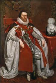
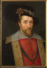
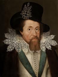
King James IV (I)

28 Feb

King_James_I_of_England_and_VI_of_Scotland_by_John_De_Critz_the_Elder

images

james6

james_i

king-james

images (1)

images (2)

Image

More Guido Designs

28 Feb

guidofawkesdrafts

Guido Fawkes Facial Expressions and look

28 Feb

In these early development and research stages I think it is good to imagine his facial looks as these re very important for emotion and being recognisable. I have used a technique that I heard from Splash Damage when they were designing Brink, characters faces and heads were combinations of celebrities features. These features were exaggerated due to the game style and created the faces. In my case I won’t be exaggerating however I will be changing facial hair and faces. This design I have done is a painting to see what it would look like, I really like the look of Andrew Lincoln off the new Walking Dead and so used him, the other person I tried to use was Johnny Depp due to his crazy facial expressions. I feel the end result leaned more towards Andrew Lincoln but I like the look!

guyfawkesface

Guido Fawkes designs

28 Feb

Here are three more detailed designs taken inspiration from a few of the things I have talked about and seen at the armouries. I am going to create more of these as they take about 10-30 mins each and so can be designed quite fast and they show enough detail to go on from. I was also thinking more about my rendering in this one, I started from a human template from the art book I have taken from the library. In this sense I could design Guido in different body shapes, from skinny and toned to full out bulky toned and big boned. I also am yet to explore colour.

guidofawkes

Transport and Ideas

28 Feb

The major transports around this time era was ships as the naval was a big thing,and of course horses which contributed to nearly all land transport either carrying goods and people or pulling carts or carriages. These images were just to have some more reference of horse poses and positions and also a ship scene. As I am thinking of design some modes of transport, I felt these good to get me started to thinking.

SONY DSC

SONY DSC

SONY DSC

SONY DSC

SONY DSC

SONY DSC

Mask and Helmet IDeas

28 Feb

Earlier I was looking at creating a character mask for Guido Fawkes much like the on in V for Vendetta or Dishonored. As a rough source of inspiration I thought of taking pictures of strange metal masks or helmets, the ones in the pictures are Dutch helmets that I felt had a more dangerous and different look about them. The really strange helmet is one of Henry VIII’s jousting helmets for tournaments, I might see what else i can find as I am sure there will be some more strange helmets in that as the jousting was to show off and perform to the crowd and other royals.

SONY DSC

SONY DSC


I like the shape of the helmet with the almost wavey shaped top but it is given the sense of dragons scales or of similar. The large eyes holes meeting low in the face give the effect of an angry look in the shape eyes make.

SONY DSC

SONY DSC


Henry VIII’s helm just gives a sense of discomfort with its strange wide eyed expression and strange glasses and horns. However this is the kind of thing I want to see to give inspiration for a mask that looks scary but also discomforting. The grin and smile also gives the same effect the mask of Guy Fawkes does, a face without emotion.

SONY DSC

SONY DSC

SONY DSC

SONY DSC

Clothing Details

28 Feb

These images show items I believe are important, especially the boots in which I like the details I they have and they are a large portion of design for the legs as I am designing high boots, I will look as slippers as well as they were popular in this time, with both the Spaniards and English. I also focused on taking pictures on things such as has the greaves and knee armour joints connect and work or how the materials are layered. One interesting thing I saw has how the sward was holstered on the hip with a scabbard and how the scabbard looked, items like these give me greater inspiration and ideas.

SONY DSC

SONY DSC

SONY DSC


I really like the boot on this soldier, I think he was either Spanish or English, the soft decorated cloths and lace behind the heavy armour create a nice contrast. The boots folds and crease are very nice and I like the idea of spurs on the boots, after all Guido Fawkes might need to be ready to jump on a horse. The reference is greta for me as I always struggle with rendering clothing and so when it comes to more final designs these images will help greatly.

SONY DSC

SONY DSC

SONY DSC

SONY DSC

SONY DSC

Swords and Shivs

28 Feb

These are weaponry mostly in the 17th century however the crossbow slightly before and some weapons in the 18th century. Of course swords became less and less used as a weapon in the late 17th and 18th century due to guns and cannons, but a swords essential to my character, quite often mercenary assassin type characters are depicted using sharp implements due to the fact they are silent and also the point that it takes more skill to kill with them, especially to get up close to someone without them knowing. I believe Guido Fawkes needs a sword and so I have taken reference for the patterns and details of sword handles, hilts and blades. There are also various shapes and sizes to consider, curved or straight, small or large. Quite interestingly they had a small exhibition on the making of the Lord of the Rings swords in which they talked about sword design and hw the blade balanced, while it wont be a physical prop it would be nice to consider details like these.

SONY DSC SONY DSC SONY DSC SONY DSC SONY DSC SONY DSC SONY DSC SONY DSC SONY DSC SONY DSC SONY DSC SONY DSC SONY DSC SONY DSC SONY DSC SONY DSC

One item I saw which I felt suited my character well was these small knives, they are the early bayonet ends used on the end of the guns but they looks like really interesting knives due to the shape of the blade. They look very much like arrow heads and it gives the sense of a great stabbing instrument.

SONY DSC

SONY DSC

Guns and Gadgets

28 Feb

The majority of guns I found were 18th century, the 17th century had guns but they were huge and literally had to be rested on fences or barricades de to the size and kick they gave off. In the 18th century guns became much more smaller and refined, pistols became possible as well as double barrel guns. The images I took were focusing on the triggers, stoppers and barrels to see how the guns look and use these design in my owns gun designs. Despite not being developed to this extent in Guy Fawkes’s time I want him to have a gun such as these that at the time is a revolutionary gadget that is within reach of technology in the time making it more believable.

SONY DSC


Below are a pair of double barrel pistols, still huge and long but I feel that could be quite an iconic and cool design having a gun that perhaps is too long wielded in one hand, much like Terminator 2 and the shotgun.

SONY DSC


I like the busy and interesting firing mechanism in this picture below, I could play on the fact the weapon would be top edge technology and have it a bit more bodge jobbed with tape and rope and  cheap items holding it together.

SONY DSC

SONY DSC


This rifle is decorated all the way down its barrel and shaft, the firing mechanism also has lots of decoration on in engravings, agan I feel this could be used to make him and his weapons stand out from the crowd.

SONY DSC

SONY DSC

SONY DSC

SONY DSC

SONY DSC

SONY DSC

SONY DSC

SONY DSC

SONY DSC

Here is the image of an early 17th century gun, this has a hook/stand to balance of fences or such items to reduce kick, the weapon is huge and impracticable.

SONY DSC

Image

Design Ideas from armour

27 Feb

I completed some quick paintings to kind of put ideas and visualizations in my head that I could take forward, for these I tried to use large brush strokes to complete the characters form in as little strokes as possible while trying to portray ideas of armour or belts and soft materials. These were in response to the more standard soldier armour, I am looking at focussing more on the character in more detailed rich armour. I have looked a little bit at a mask here as I like the idea so I will see whether I will design more or whether I think the mask can be discarded.

Untitled-1

Design a site like this with WordPress.com
Get started